Portfolio
Take a moment to look through some of my selected web, logo, and print designs, as well as a few writing samples. If you like what you see, and would like to see more, please let me know. I have plenty of work to choose from!Web Design
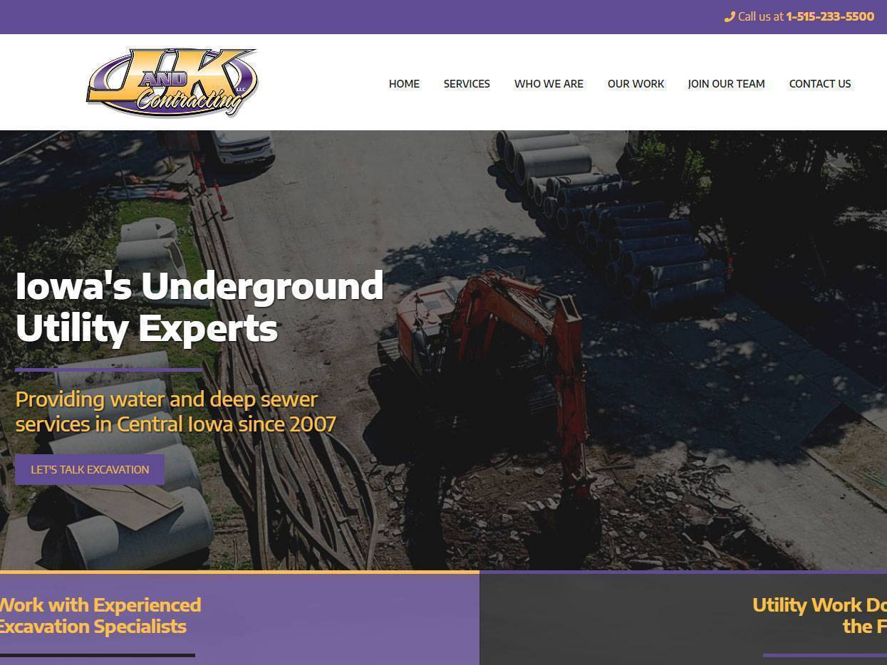
J&K Contracting of Iowa
The priorities for this underground utility and excavating company included freshening up the site and implementing printable and online applications for potential employees.
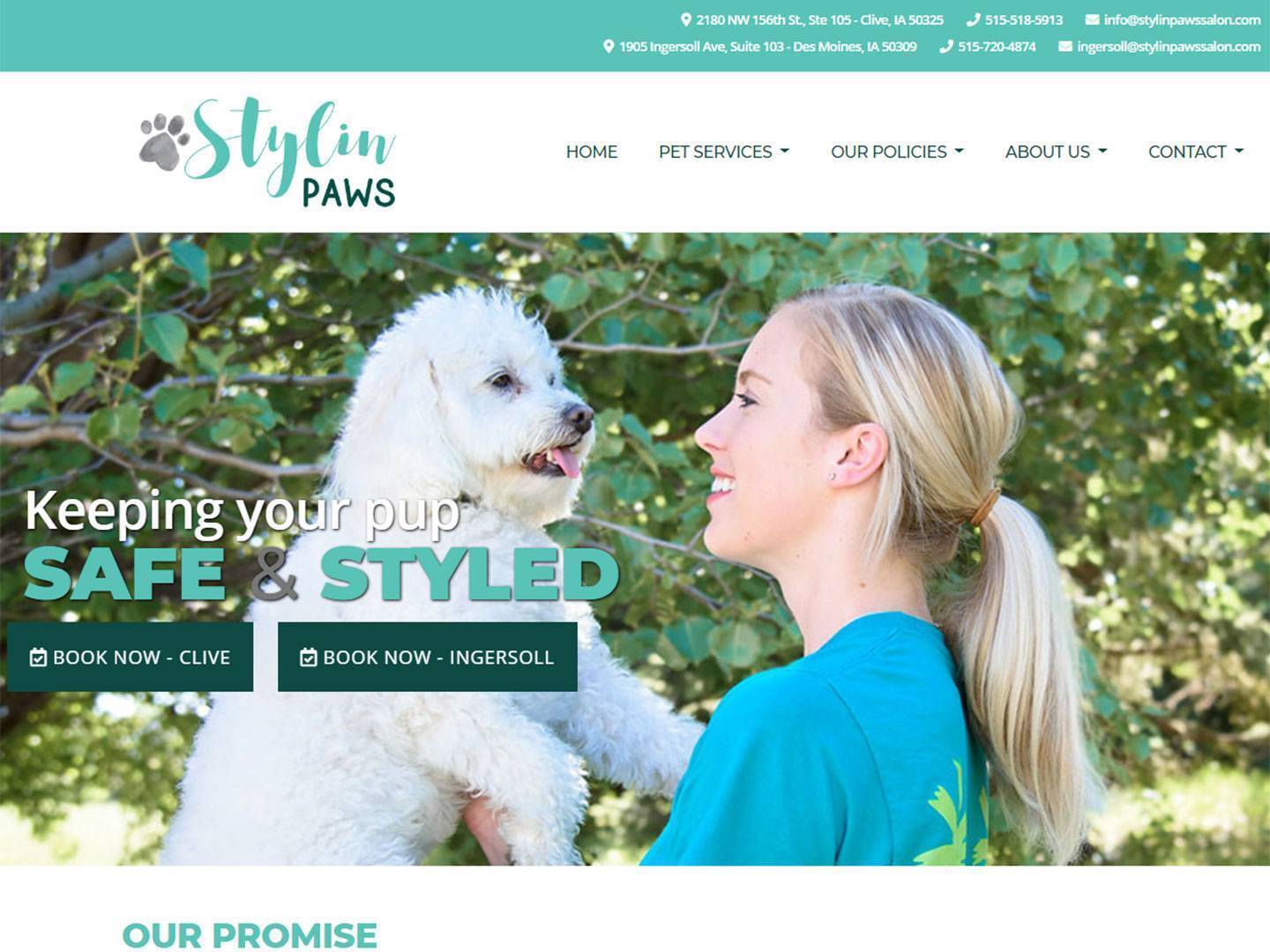
Stylin' Paws Salon
A local dog salon and daycare with multiple locations was looking for a fun, professional site that would highlight their services while creating a more user-friendly booking process.
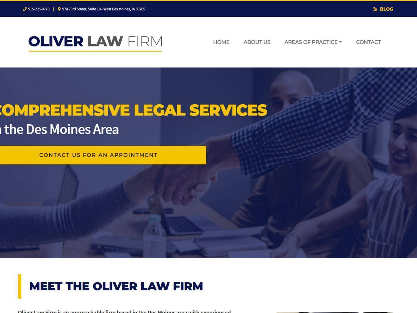
Oliver Law Firm
This law firm was looking for a new website with a simple and concise design to help showcase their areas of expertise and encourage potential clients to contact them for more details.
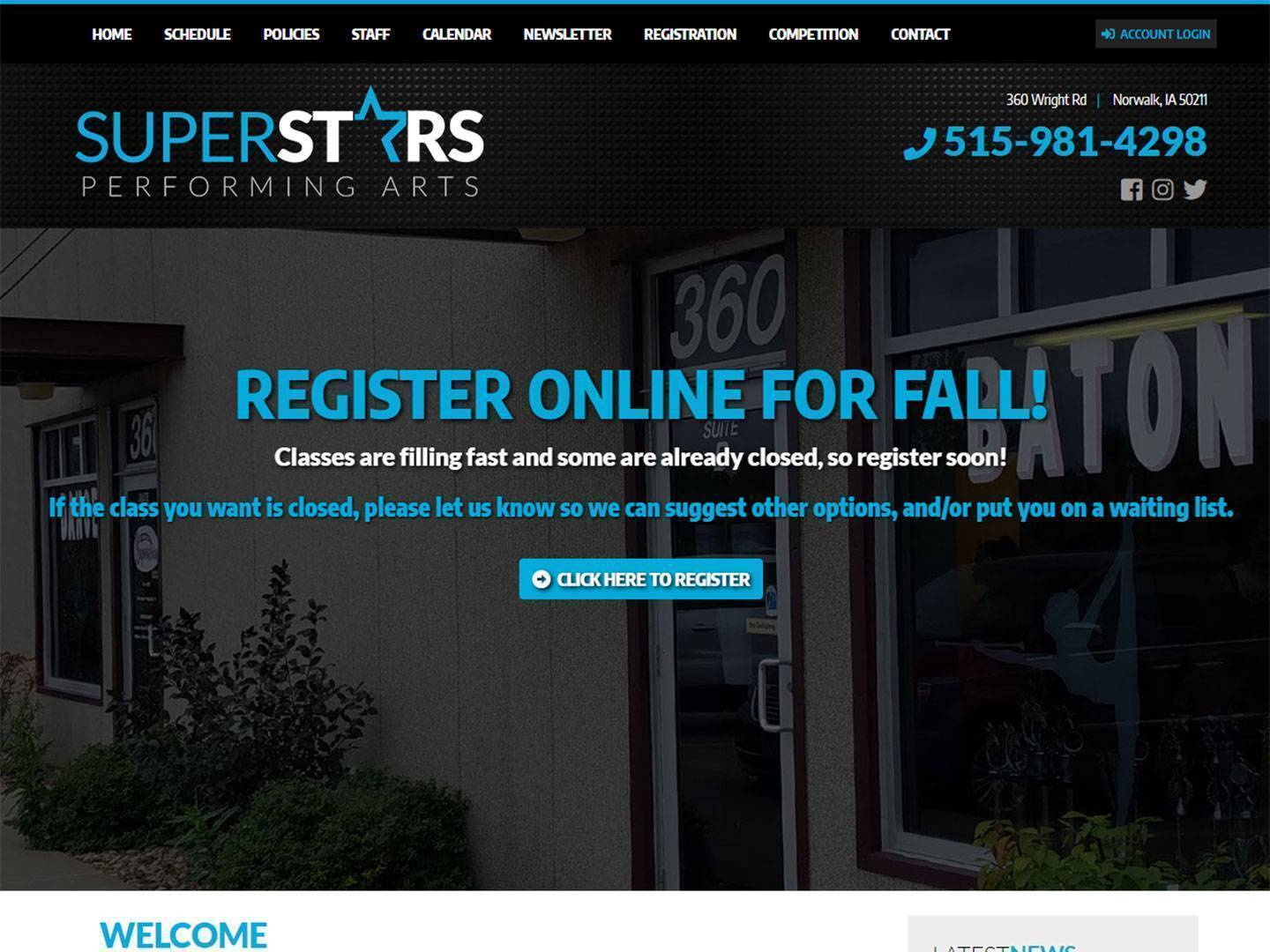
Superstars Performing Arts
It was important for this website to be exciting and informative, so parents and students could easily find more information regarding classes, schedules, staff, and studio events.
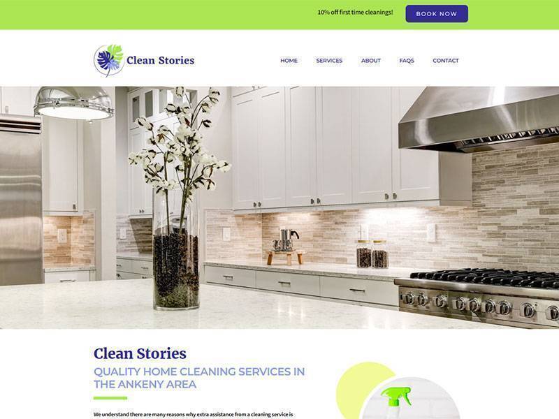
Clean Stories
Since the client is a cleaning company, the design of the site is fresh and calming. Goals included showcasing services and making it easy for clients to contact them.
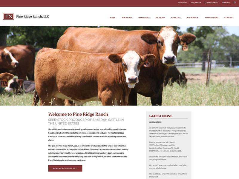
Pine Ridge Ranch
A redesign for this client was needed so the new site was mobile-friendly and professional while continuing to highlight the diversity in their program, animals, offerings, and events.
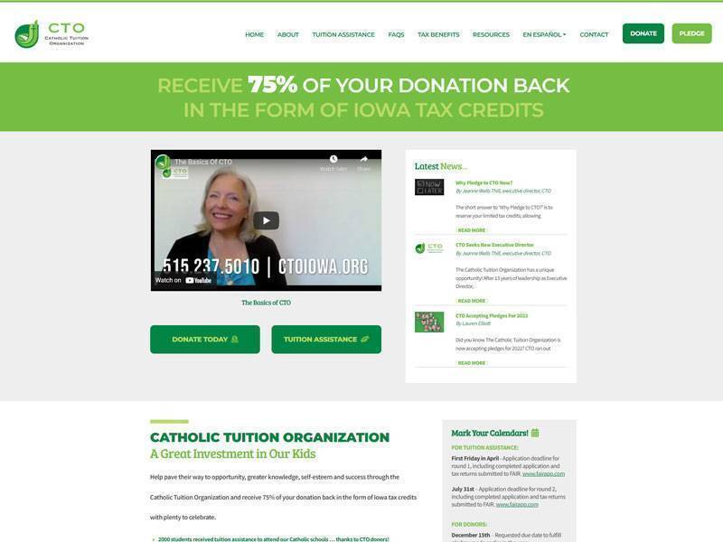
Catholic Tuition Organization
Increasing awareness and donations for this organization that provides assistance to families attending tuition-based Catholic schools was the goal, so I prioritized creating an inviting design.
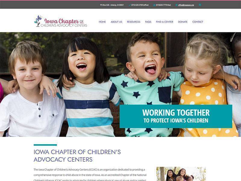
Iowa Chapter of Children's Advocacy Centers
This was a fulfilling project and the new design highlights the important mission of this organization and provides resources for those who could benefit from their services.
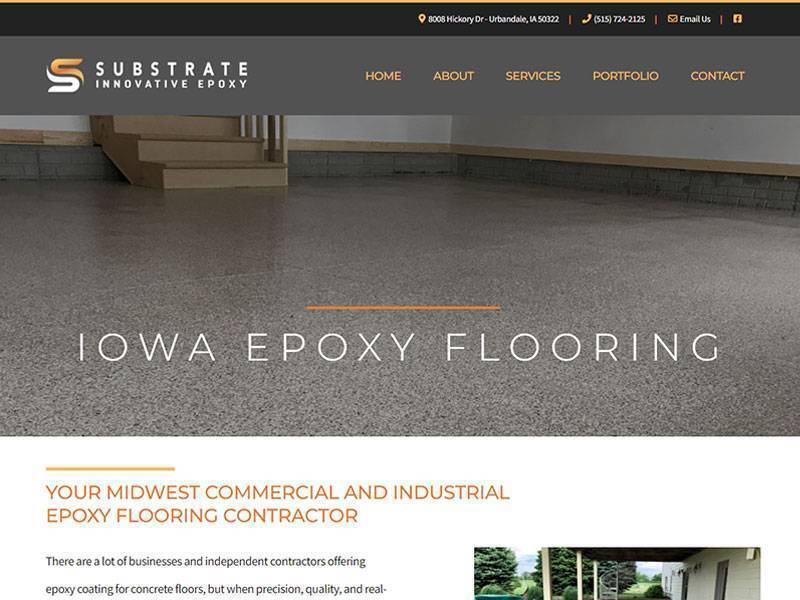
Substrate Innovative Epoxy Flooring
Thanks to the increase in popularity of home renovations, the client needed a new website that showcased and explained their innovative epoxy flooring service.
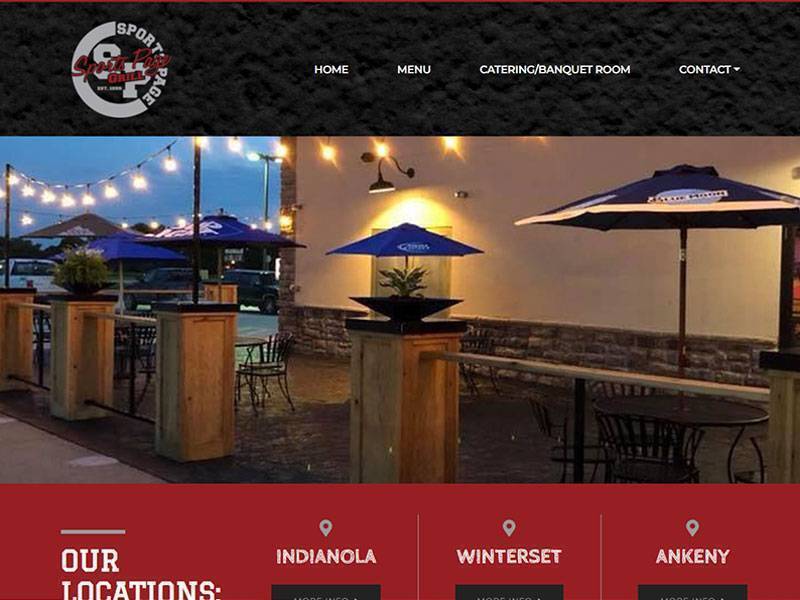
The Sports Page Bar & Grill
These clients needed a dual site to share menus, catering options, locations, and more about their pizza tavern and bar and grill. The designs reflect the sporty, welcoming feel of each.
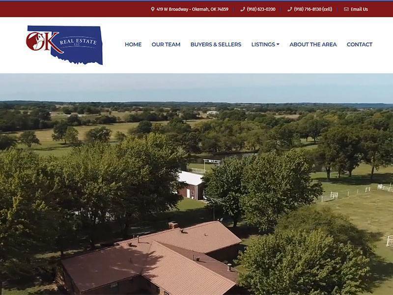
OK Real Estate
One of many collaborative efforts between myself and our programmers, this site for an Oklahoma realty company clearly and immediately showcases available real estate.
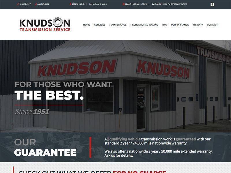
Knudson Transmission
Overall, the site goals were to highlight the client’s expertise in transmission services and available options for potential customers while feeling approachable.
Logo Design
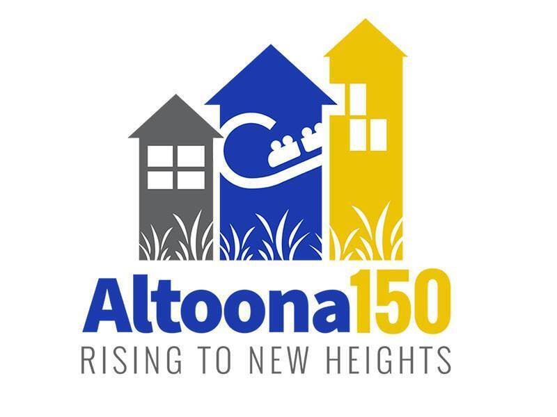
Altoona 150
This logo was designed for my community's 150th celebration. My intention as to highlight the increase in our population, the expansion of our popular amusement park, and the recent addition of the Des Moines metro's first outlet mall, which is located in our city. I attempted to mirror the tagline of "Rising to New Heights" with these facets of our community by designing them angling upward with subtle arrows at their tops.
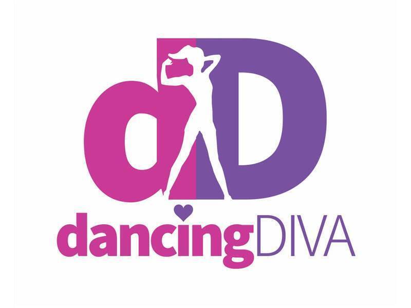
Dancing Diva
This was a logo I designed for a friend I grew up dancing with, and who had previously owned her own dance studio. She had recently moved to the Des Moines area, and was starting to offer her services for fitness classes. The classes she offered were different than others, as she pulled from her dance background and incorporated them into her classes. She wanted a logo that conveyed both her passion for dance, as well as fitness.
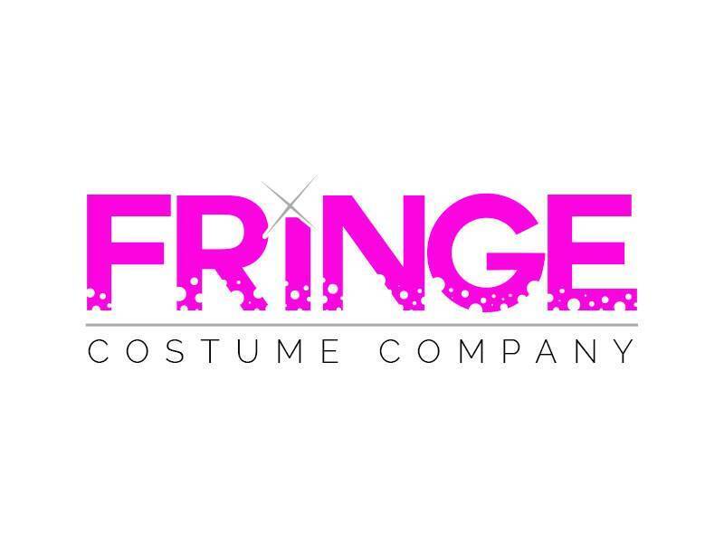
Fringe Costume Company
This was another logo created for a dance friend. We both taught dance and directed competition teams for different studios in the area, and created a strong friendship through that. She regularly designed and made the costumes for her dancers, and had a dream to start her own national costume company. When she decided to take the leap (no pun intended), and asked for my help with a logo, I was honored to put this together for her.
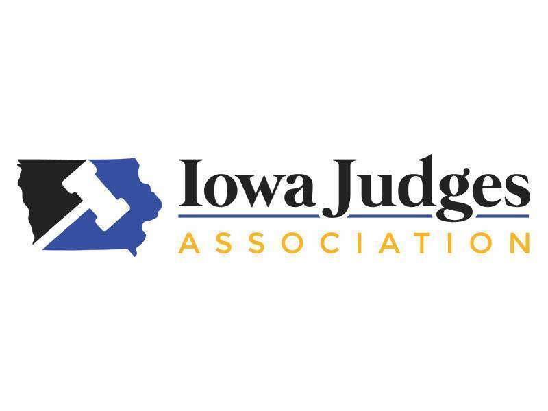
Iowa Judges Association
This logo was recently designed and created as a project for my current employerfor a client that wanted to build a website for their members. A clean, professional logo was the initial step in their branding. They requested something that would convey who they were, but one that also included an image of Iowa. They asked for blue and black, and eventually, asked to incorporate gold also.
Jack Tamisiea
Another logo that was also created for a client of my current employer. Jack Tamisiea is a freelance science writer who is pursuing his Masters in Science Writing from Johns Hopkins University. In addition to his writing, Jack is also an artist and loves exploring nature. He is a man of many talents, and wanted a logo that would brand his diverse talents in order to share them with the world.
O-Em-G Goodie Bakery
This logo was created "just for fun" for my sister-in-law, Emily. She is an incredible baker and had mentioned what a dream it would be for her to open her own bakery someday. As that night progressed, I came up with the name "O-Em-G Goodie Bakery", as a play on her nickname, Em, and a newly popular catchphrase, and the rest is well...history.
Ronaix International
Another example of a logo that was created for a client of my current employer. They hired us to brand their company, and the logo was the first step in that process. Ronaix International shares a common vision with growers around the world in the pursuit of "Green" Sustainable Intensification for their farms. Therefore, they wanted a logo that showcased their vision, so the green leaf was incorporated into the globe to represent that.
Salon Revolution
This freelance logo was created for a friend who owns a local salon. She requested red and black for the colors, and wanted something bold and simple. She used the term "revolution" in her salon's name because of its implication of turning things around - whether that be literally, or figuratively. She also wanted something that would portray her image as a beautician, so the half-circle 'swoop' was incorporated for those reasons.
Shredward's Lawn Care
I created this logo for my nephew, Eddie, who affectionately earned the nickname "Shredward" when he decided to open a lawn care business to earn some extra cash. Since he would be 'shredding' the extra grass from his clients' yards, the nickname stuck and became the name for his side gig. Obviously, green was the obvious choice, and I created this logo for him to use on business cards, flyers, postcards, and apparel.
Simply Be Coffee & Gift Shop
I created this logo for my brother-in-law's sister when she expressed interest in opening a combination coffee and gift shop. She had chosen this name because she wanted those who entered to have the freedom to 'simply be' themselves. She wanted an image of a bee to be incorporated, and it ultimately became the dot of the 'i'. The colors came from the bee, and we were both pleased with the final product.

Simmentals of Texas
This logo is an example of another project that was done for a client of my currently employer who is a Simmental cattle producer in Texas. He requsted the outline of Texas, and had asked for the image of a Simmental bull to be included in some capacity if possible. I used the outline of Texas, and filled it with the Texas state flag, as well as its 'lone star', and also added a subtle silhouette of a Simmental bull head.
Superstars Performing Arts
I created this logo for the studio I co-owned with my business partners. After taking over ownership, we wanted to establish a new brand that was unique to us, and one that was more updated than the previous logo. We chose new colors, and I decided to play off our studio's name by making the 'A' in our name a star. This logo has been used on all studio collateral, and was retained by the new owners as well.
Print Design

Nursery Print
I created this design for my nephew's nursery. My sister-in-law had purchased two other prints online - one with the alphabet, and other with numbers - all with random fonts, sizes, and directions. She wanted larger print to be cohesive with the others she purchased, and had requested one of her favorite Shel Silverstein quotes to be included as well. We were both pleased with the final product.
Dance Team Shirt
I created this t-shirt design for the 50th Anniversary of the dance team my wife coaches at Southeast Polk High School. The team has a long tradition of excellence, and is well-known in the state, and even nationally. Many young people have been part of the team over the years, and they wanted something with the school's colors to celebrate the team's incredible milestone.

Dance Studio Shirt
This was a shirt that I designed for the studio I co-owned. Every year, we designed and provided t-shirts to our students for them to wear for our studio events, to class, and randomly to show their pride in the studio. This design was one of my favorites, as it included our studio name along with the subtle addition of the stars and the silhouette of a performer.
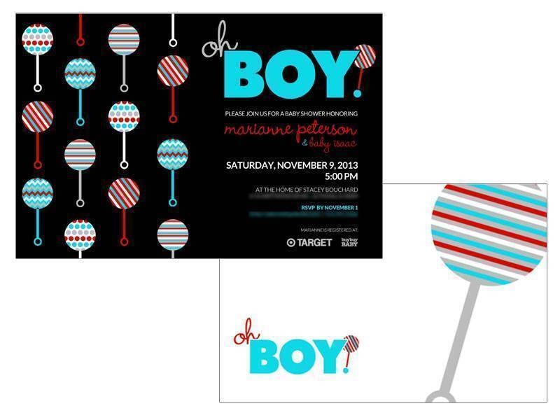
Baby Shower Invite
These baby shower invites have sentimental value and meaning to me, as they were designed by me for my son. I had always dreamed of being a dad, and the excitement surrounding our baby's arrival was something very special. My wife and I had chosen these colors for his nursery, so I incorporated them (as well as a little play on words) into the design of the invitations also.

Golf Tourney Gift
This design was done for a company that was hosting a charity golf tournament who wanted to include something custom and unique to each donor's "swag bag" at the completion of the tournament. The silhouette was the company's idea, and I decided to make it out of words that had to do with the event. Each participant received a customized framed print.
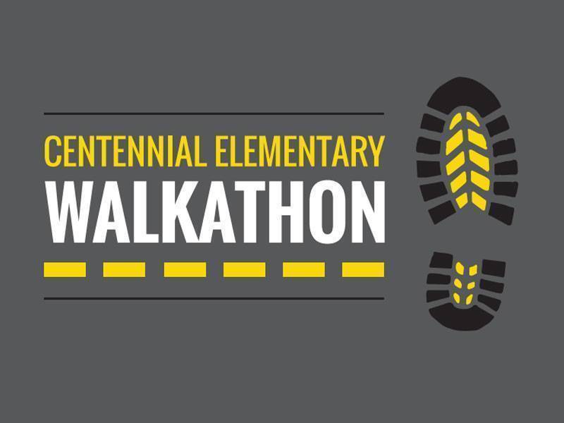
Walkathon Shirt
I designed this t-shirt for the walkathon hosted by the elementary school where my wife teaches. Every year they host this event to raise funds for the school. When word spread that my wife was married to a graphic designer, my services were requested and I was thrilled to have the opportunity to design this shirt for such a wonderful and worthy cause.
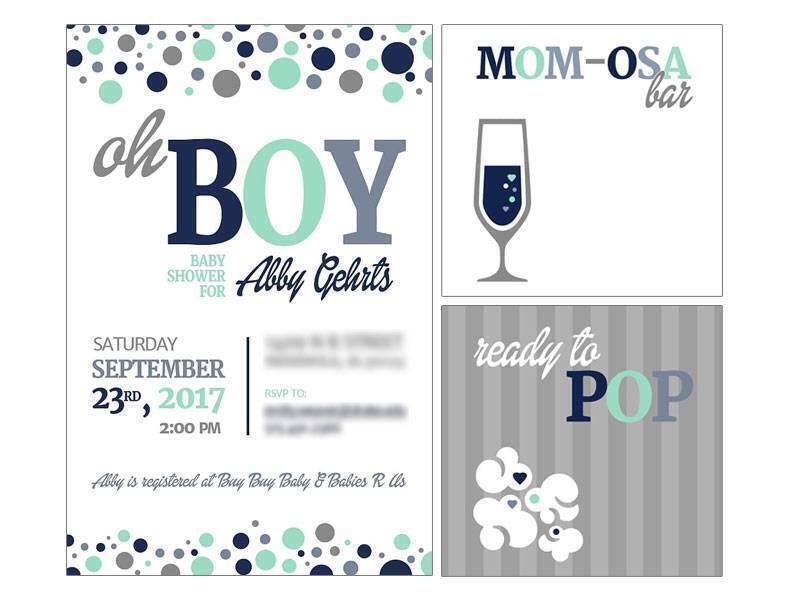
Baby Shower Collateral
These baby shower designs were created for my wife's cousin when she was expecting her first child. The colors were requsted by the host of the shower, and I had fun creating a play on words for the invite. When I found out they were having a Mimosa and popcorn bar, I couldn't resist and again had to incorporate a fun play on words for the framed prints that were included on the tables.
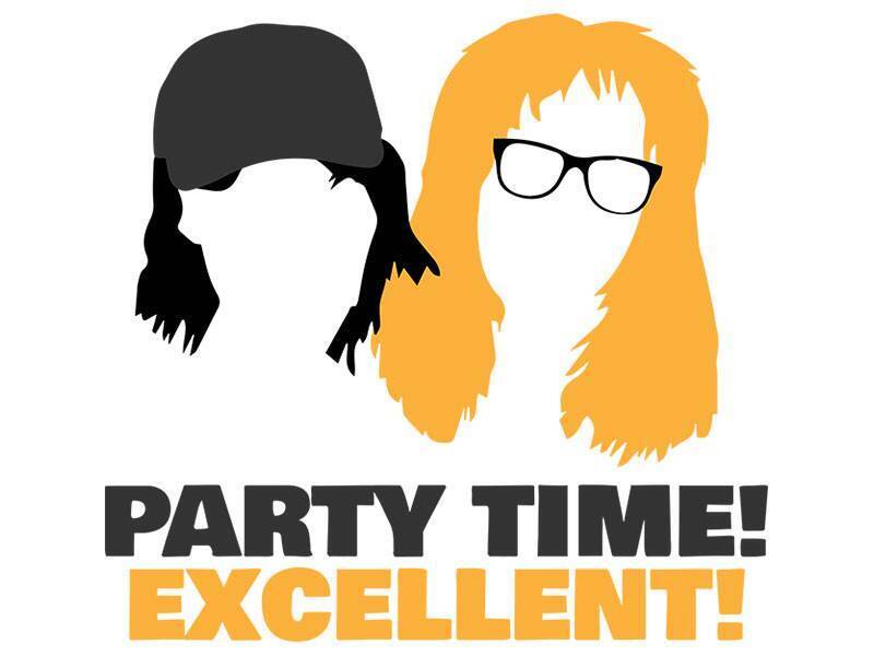
T-Shirt Design
This design was honestly just made for fun. As a teenager in the 90s, 'Wayne's World' was one of my all-time favorite sketches on Saturday Night Live, and I wore out my VHS copy of the movie from watching it so many times. I loved these characters, and thought a vintage throwback to them would be a fun project. I haven't printed this on a shirt yet, but plan to.
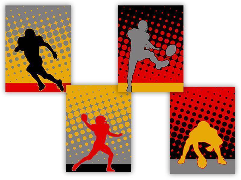
Bedroom Wall Prints
I recently designed these prints for my son's room. Over the past couple of years, he has turned into a football fanatic, and decided to include some of his favorite football positions. I used all the colors from these three teams (KC Chiefs, ISU Cyclones, and our local Southeast Polk Rams) to design these prints, hoping he would approve ... and he certainly did! They were a hit, and it did my heart good.

Christmas Shirt Design
As a dance teacher, I taught kids of all ages during my career. During Christmas time, I would always overhear a certain age of students debating the old "Is he real?" argument every year. It was a little heartbreaking because I knew some believed and some didn't. This shirt was my subtle way of showing support to my students who still believed. (And honestly, I'm a huge fan of Journey, too.)
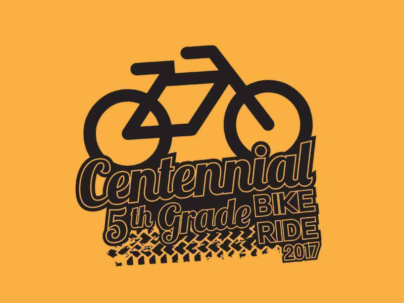
T-Shirt Design
This is one of many t-shirt designs I have done for my wife. She teaches 5th grade, and all the 5th grade students participate in an annual bike ride at the end of each school year. The 5th grade teachers supply their students with special t-shirts to wear for the occasion each year. I always enjoy working on these designs for her, and for the students to wear on their special day.
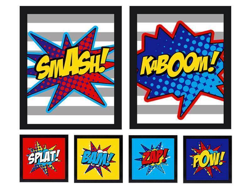
Superhero Room Prints
I designed these prints for my son's bedroom when he was going through his 'superhero' phase. I didn't want them to be character-specific, and wanted to work with the colors he had requested. These prints never made it past my computer, though, as this phase of his life came and went pretty quickly. (Honestly, I was always a little bummed that I never saw them "come to life.")